I spent the semester designing a system that makes shopping for women like myself, tall and curvy, a more pleasant and enjoyable experience. I wanted to design a store that focuses on finding the best fit for body shapes, providing better styles and excellent customer service while boosting women’s confidence. That brought me to Homegrown Threads.
Homegrown Threads is a boutique style clothing store. It would feature clothes from all over that fit within the store’s standards for size, as well as having it’s own in-house brand.
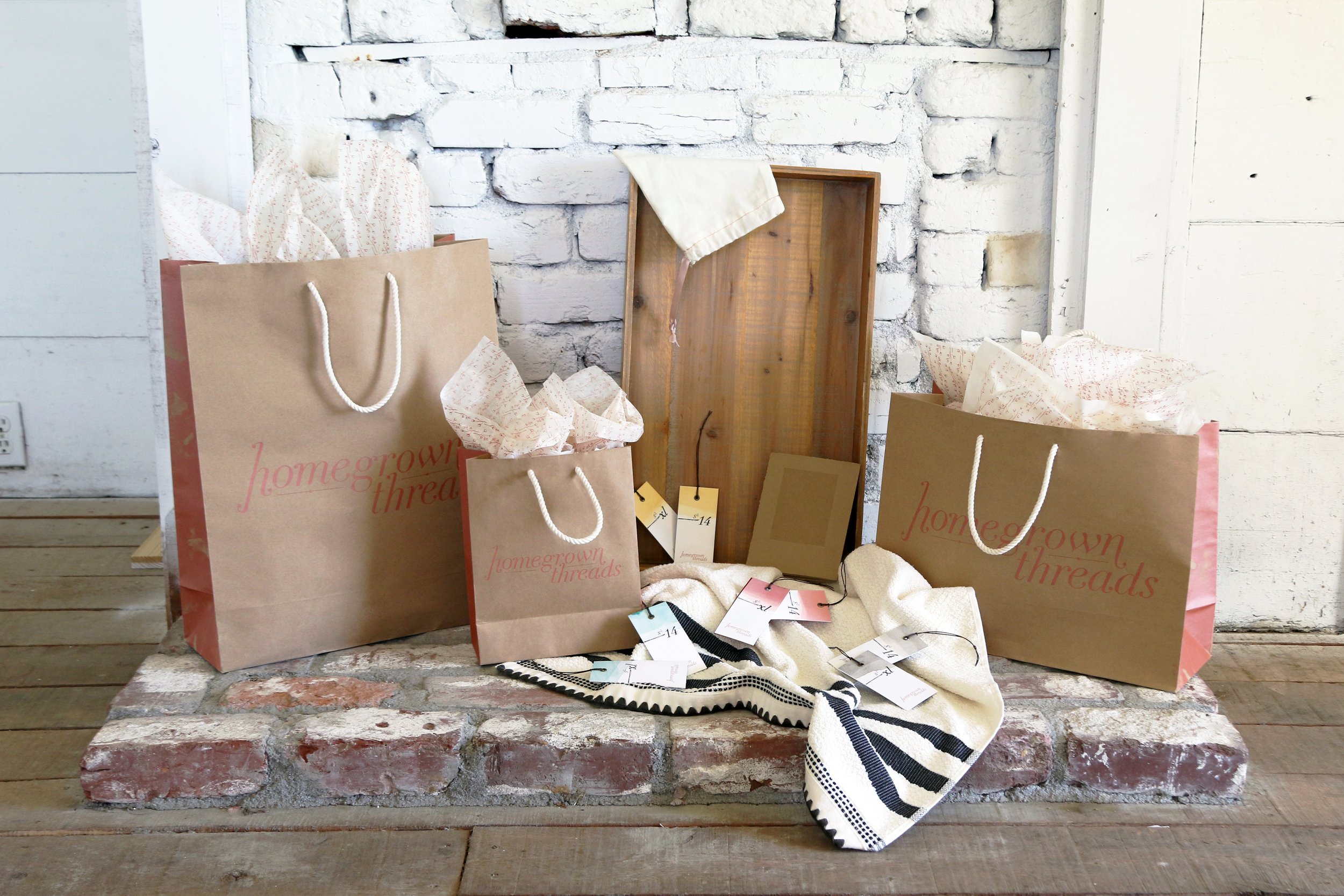
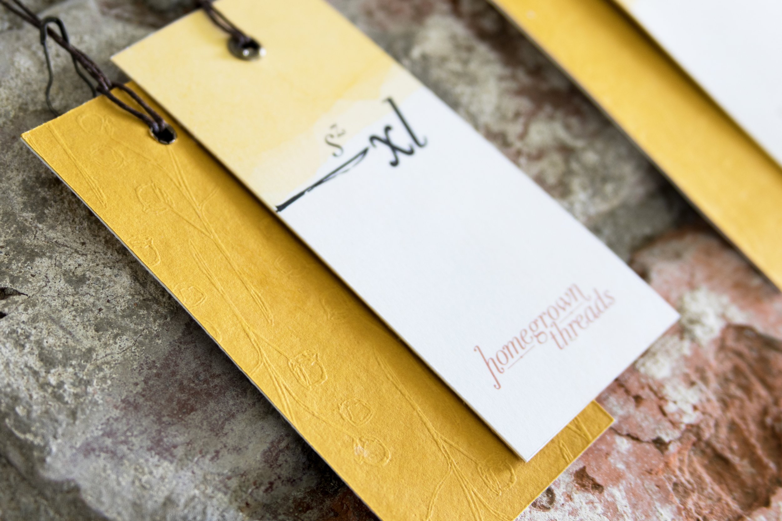
This store was designed with customer satisfaction and positive shopping experience in mind by creating a unique tag system. The tag system is divided up into 4 colors. Each color represents a different body shape. These body shapes have been renamed to make them friendlier and less shaming. The yellow symbolizes a round body shape, we call this the "Sunflower." The blue symbolizes a pear body shape, we call this the "Dew Drop." The red symbolizes an hourglass body shape, we call this the "Bowtie." Last but not least, the grey symbolizes a rectangle body shape, but we call this our "Jar of sweet tea."
So how does one know what tag color they are? At Homegrown Threads, we would offer certified sizing experts that will take your measurements. Once your measurements are taken, your proportions determine what body shape you have. Then, shopping is made easier by simply looking for the colored tag that corresponds to the shape. Keep in mind that these are only suggestions. One doesn’t NEED to use our tag system, it’s made to make shopping easier.
Once your body shape is determined, the customer will then receive our booklet. This booklet talks about our store values, holds your measurement card which has the color to correspond to your body shape, and explains what those numbers on the card mean. Because getting measured can be an intimidating experience, we take our customer’s privacy serious. Each booklet comes with a cloth bag for easy storage and privacy.
All of these features have been designed into Homegrown Threads with the intentions of making shopping a pleasant experience and giving back confidence and quality in clothing.


